
{ggborderline} provides a set of geoms to make line plots a little bit nicer. Use this package along with ggplot2 to:
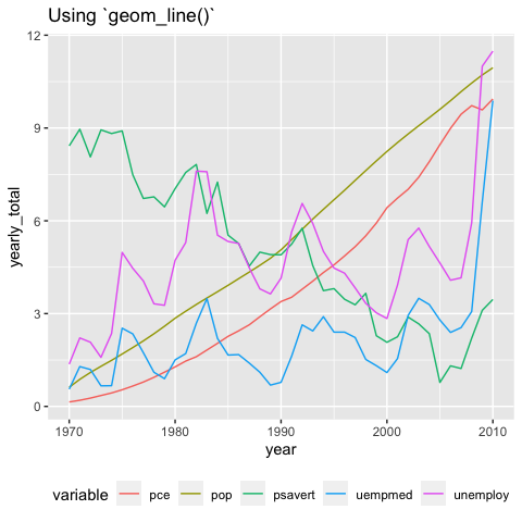
Simply changing ggplot2::geom_line() for geom_borderline() can make a big difference:
library(ggborderline)
library(ggplot2)
library(dplyr, warn.conflicts = FALSE)
library(patchwork)

plot <- economics_long %>%
  group_by(year = lubridate::year(date), variable) %>%
  summarise(yearly_total = sum(value01), .groups = "drop") %>%
  filter(year %in% 1970:2010) %>%
  ggplot(aes(year, yearly_total, colour = variable)) +
  theme(legend.position = "bottom")

plot + geom_borderline() + ggtitle("Using `geom_borderline()`")
plot + geom_line() + ggtitle("Using `geom_line()`")

You can install the development version of ggborderline from github with:
I designed my first double-page #dataviz for The Economist!
— Rosamund Pearce (@_rospearce) July 2, 2021
It depicts our new ‘Normalcy index’, which tracks the world’s return to pre-pandemic life >> https://www.economist.com/graphic-detail/2021/07/03/our-normalcy-index-shows-life-is-halfway-back-to-pre-covid-norms pic.twitter.com/1sIUMoZco1
While these effects can be achieved using {ggplot2} alone if you have the patience, there are other packages which provide other methods for achieving bordered lines. {ggfx} is much more powerful, but would perhaps be overkill for something as simple as adding a border around a line. {ggshadow} is another great alternative which implements the shadow using a slightly different approach, and also comes with some other handy features. You are encouraged to try both!
This package would not have been possible without the fantastic ggplot2 package, and would have been very difficult without the accompanying book. My humble and sincere thanks go to all the authors who make projects like this possible.